Friday, November 26, 2010
Hail Blackberry Boys!
Friday, October 15, 2010
Need an India ShopRunner?

Monday, September 20, 2010
Out-of-the box!
Sunday, July 25, 2010
Are you Loyal?

Tuesday, June 8, 2010
Product Engineering

Thursday, June 3, 2010
Brand Stereotypes and Makeovers
I don't particularly hold brand stereotyping as a negative. Indeed, it enables the target audience (or consumers) to associate the brand with something pleasant or desirable (atleast the intent is such), thereby helping them to either identify with it or aspire for it. So, in theory, a positive brand image should ideally run a consumer through the entire brand cycle of awareness > association > consideration > experience > preference > loyalty, giving birth to three more fancy terms in the marketing jargon - Brand Association, Brand Perception and Brand Image! Let me explain each of these three terms, taking Kingfisher as an example.
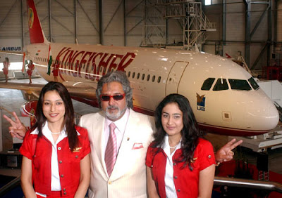 (I will list down whatever comes to my mind with regard to the brand’s manner, personality, behavior, ethics, values, aspirations, etc! Readers are welcome to add.)
Brand Perception: Flamboyant, Sexy, Expensive
Brand Image: An up-market air carrier with good hospitality - one of the best on- board comforts, in-flight entertainment systems, airline crew in India
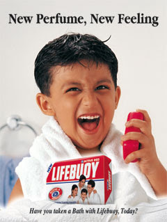 The cons of stereotyping, however, can be equally detrimental. For example, I would any day choose any decently-known bathing soap over Lifebouy, because my childhood memories compel me to still associate the brand with a fuchsia pink soap with a detestable odor. Wonder how much has the improved product and the new ads with fancy models helped change the target audience's perception. And I say target audience, not consumer, because the brand would aim at an aggressive conversion of its prospects (who fall in the broader 'target audience' group) to customers, while safely assuming that the existing customers have a satisfactory experience with the brand. (Albeit at the same time, I am sure that the fuchsia pink Lifebuoy does have a good consumer base, just as ‘Ghari’, the most profitable detergent in Uttar-Pradesh with a robust and loyal pool of customers.)
So, to sum it up, it’s a win-lose deal. You win if you can form the right Brand Image, complement it with your product or services, and hence sustain it. Once you have done that, you are sure to capture more customers and expand your base even within your target segment. However, the problem arises if you go amiss or decide, at any given point, say maybe even 10-15 years later, to start afresh or in the marketing lingo, to affect a makeover. This would mean that you dissociate yourself with your past and present, by fighting a battle in the minds of the consumers, and form new perceptions, associations and image. A task which involves planning and scheming by some astute brand pundits and marketers, and typically takes a long time, costs a bomb, and has the calculated risk of being unsuccessful.
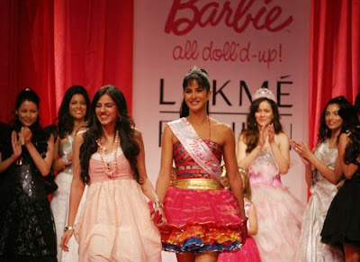 But then of-course, there have been successful 'makeovers' where a brand changes everything about itself in a bid to change its image or the perception of its target audience. Lakme perhaps would be an apt example! It has taken a huge leap from being traditionally housewife-ish to being trendily housewife-ish. Some of the prime ingredients that have gone into the makeover: revamp of products and their packaging, sexy brand ambassadors (started with Yana, and Katrina now), aggressive advertising post celebrity endorsement and Lakme India Fashion Week.
The change has been reflected in the brand's collection, essentially the color palette, which is now localized to suit the Indian complexion and taste. (I couldn't find 'sindoor' for my wedding ceremony anywhere else but at Lakme. FYI, Lakme markets 'sindoor' in shades of red, maroon, gold and copper). The new packaging ensures visibility on the shelf, and compact-ibility for ease of carry-ability. Its distribution network covers local departmental stores as well as malls in most metros, mini-metros and sub-urban areas. I believe, another reason why Lakme has been successful at the makeover is because they have made corresponding changes to its offerings in sync with the brand's new visual identity, associations and image - something which many companies fail to realize. To top it all, Lakme also has a slight price advantage when compared with the other cosmetic brands in the segment.
Lakme extended this success story when a new chapter began for the brand with the inception of Lakme Salons, and now the high-profile Lakme Studios. It is very interesting to note how their salon services are not only premuimly positioned and targeting a higher strata of consumers than its cosmetic products, but also premiumly priced. Of-course they have the first mover's advantage in the 'salon space', being one of the many organized players in the segment.
The makeover makes for an interesting case study although I will not vouch for the fact that the other brands can replicate their success because like I said, it involves a lot and costs even more. HLL is a giant in India and Lakme is their backbone, and I believe their investment was justified from a ROI point of view for them. Godrej has attempted one such makeover, and so has PNB (Punjab National Bank), as also other known and lesser known brands, but they don't really account for success stories. And I can assume that some of them are in business due to their sales team, and not really the marketing.
- Namrta R
PS: Thanks for your feedback Jas!
Thursday, May 20, 2010
Constitutents of a Brand
The term brand originated from the Old Norse word ‘brandr’, meaning to burn, and is of Anglo-Saxon origin. In the olden days, around 4000 years back, farmers used to mark their cattle, and other livestock, for easy identification by burning the hide. This practice was later replicated to mark fugitives, galley slaves, gypsies, vagabonds, brawlers, and even clergy for an easy identification. However, in the days to come though this practice of burning hide was eventually replaced by painting on the livestock with pine tar or paint, but the term ‘brand’ remained with us forever, and evolved as a concept to be discussed in the finest B-schools across the world. And what also remained back with us were the Egyptian tomb walls, dating back to 2000 BC, which also have some peculiar marks for easy identification, as a fine example of the then branding. Whatever said and done, there is no two-way about the fact that the basic role of a brand, evidently, was to serve as a platform to identify and differentiate objects, like from like, or like from unlike.
Lets now fast forward to the present, a world which is so very 'branded'. Its like living in a closet full of brands, weird analogy, but that's how I feel. I eat, drink, wear, drive, play, talk, write, feel, think and use brands all the time. Infact I feel that I also breathe brand, since the air conditioner, and even the residential or office space is branded :)
Although the constitution of brand is more complex in today's competitive and saturated market, yet the basic role of a brand remains pretty much the same, ie, identification. In the past, it could be a letter, numeral, character, or symbol, or a combination of one or more of any of these, or all of these, however today I would describe a typical brand as a sum-total of the following elements:
1) Name: An identity, much like your name. Imagine if a brand was to have only a visual representation, and not a name, how would someone talk about it. Its like living in a world without names where people talk about each-other by, let’s say, referring to pics. So, we would all need to carry a photo album with us wherever we went, with everyone's pic, everyone we know of of-course. And when we want to refer to a third person, in the course of our conversation, we would need to out our album, look into the index for the right he-she, then flip to the right pic, and start talking. And when we meet someone new, rather than the business card, we would exchange our pic. Sounds funny, but seems like the only possible solution. I would actually maintain albums under categories like 'hot', 'medium' and 'ugly' ;) Or use an i-phone to make things lot easier :) Only catch would be to communicate to people who aren't quite gifted with sight or vision, or simply put are blind.
2) Logo: A visual identity, and very crucial for brand, esp (i) when the name of the brand is difficult to pronounce, or not-so-sure kind of a term (eg Gucci, Actis, Lacoste) (ii) while communicating either a local name to an international audience (eg Haldiram, Ayur) or an english name to a non-english speaking country (iii) while communicating to an uneducated or illiterate audience who can't quite read.
3) Tagline: Often used to sum-up the essence of the brand experience, or the value which the brand promises to deliver. It can also be used for enforcing a higher/top-of-the mind brand recall, by being a catchy or memorable jingle. And some of them could be effective like 'thanda matlab Coca Cola' or 'No one can eat just one'! So, next time you ask for 'thanda', you may actually land-up saying 'Coca Cola' instead, and you may not want to share your bag of chips. (Disclaimer: I don’t have statistics before and after the campaigns to prove if these taglines have actually resulted in an increase of sales and revenue)
4) Typeface: An important constituent, but the least important amongst all of them, and a sort of secondary visual identity. Infact, in many cases, it may even replace a logo. Like the typeface for Coca Cola is a unique font, and patented by the company. Even brands like D'dmas and CRY use a typeface in place of a logo. However, most brands use both the logo and the typeface, like Gucci, Reliance, Castrol, Tanishq, Shell, so-on and so-forth.
I don’t know if this was fair dissection of the term ‘brand’ but I am quite evidently, quite fascinated by the whole phenomenon of branding. And if I could make my bread, butter and fuel out of it, then I guess I would just ideate brands - their name, logo, tagline and typefaces, to add yet another ‘member’ to the closet I live in!
Watch this space for more on ‘Brands’!!!
Wednesday, May 5, 2010
BJN: A case in Corporate Branding
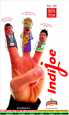
So, a few days back when I came across this ad while flipping thru ‘Bangalore Times’ – a supplement that most people swear by, I was struck by a clear, white background with a clear, distinct message!
Unlike customary, the ad had no headline, sub-head or body copy, instead it conveys the message pictorially. An ad for the famous hangout – ‘Indijoe’ – it achieves the following objectives:
1) Educates the readers about the three branches Indijoe has in the city.
2) Gives the ph nos for each of the branches – for enquiries regarding cuisines or timings, making reservations, or just finding the driving directions to these joints.
3) Brands BJN Group. Indijoe, being a successful hangout, can have a rub-off effect on the Group company and form favorable associations.
4) Takes a step further by establishing further credibility with a timestamp ‘1998’ – a very ‘been there, done it!’ approach, thus portraying the group as an established company.
Well, I just couldn’t ignore the strong element of Corporate Branding in this ad, which cannot be anything but a conscious management decision. So, I did wonder and put some factors down that may have prompted a strong focus on the parent Group.
1) The Group is looking forward to diversify in related fields, like hotels, tourism, etc. However, my guess is that they wouldn’t move out of the ‘hospitality’ domain.
2) The Group is going global. Now-a-days, everyone seeks an easy way out by way of acquisitions to save the trouble of starting from scratch.
3) The Group is going public. Boy, then they would require ‘some’ branding to ensure a good ‘List Price’ for their IPO.
Besides Indijoe, BJN also owns several other brands in the city, 13 in total (if I may rely on my credit card statement – since half my salary goes to them every month), namely - Samarkand, Hypnoes, Angeethi, Aromas of China, Phirnagi Pani, Sahib Sindh Sultan, Bombay Post, etc. They operate in six cities – Bangalore, Mumbai, Pune, Hyderabad, Gurgaon and Jaipur.
Ah, it is beginning to sound like a ‘Boiler Plate’ for BJN…
- Namrta R
Sunday, April 11, 2010
Sleep with your wife
OOH..!
Yes, OOH or Out-of-home advertising is a booming industry segment, with the key driver being billboards or hoardings. Though hoardings are the most traditional and commonly used medium of OOH communication, yet it's unbelievable to see so many guys go wrong with them.
In my opinion, we should strictly adhere to the following principles for a billboard to serve its purpose better, keeping in mind the placement of a billboard usually a prominent traffic signal or on a highway:
1) It should convey just THE key message, only and only one in number!
2) It should not be cluttered, be it with text or graphics.
3) It should have only the headline and the sub-head; no body copy pls, considering it would be mounted up at a considerable height.
4) It should be catchy enough to draw the attention of the commuters through the route, assuming of-couse that most of them are a prospect for us!
5) And of-course, the only determining factor for selection of the billboard site should be the foot falls of target audience, and not the absolute cost, size, etc.
One of the finest examples of billboards I have seen recently, is a hoarding for Indigo airlines. With a background in indigo, also the corporate color for the airline, the billboard has only three elements, a headline, a sub-headline and a logo - all in color white on a plain, single colored indigo background.
Sleep with your wife
Same day departures from all metros
[Indigo airlines Logo]
No graphic, no design and not even a tint, but never-the-less, extremely catchy and I can also bet, one of the most effective billboards ever. I can't but applaud the genius who created this hoarding, which conveys the key message so ingeniously. With a headline which grabs attention at once, and gels well with the key message or the sub-head, the communication is most catchy, clear and crisp. A 'no-graphic' approach draws attention to the brand logo, which further reinforces the brand recall. Kudos guys for the play of words! Put-up at a prominent traffic signal at Golf Course Road inGurgaon, near the hub of MNCs, it also gets the right eye-balls.
Facts about OOH: According to the FICCI PwC report, OOH is expected to grow at a CAGR of 13% from Rs 11 bn in 2006 to Rs 17.5 bn in 2010. This growth is further propelled by infrastructure development in the form of highways, expressways, airports, increase in commuting time, with the only threats being either the economic downturn or the pace of development.
- Namrta R
Wednesday, February 3, 2010
The Killer McD
Suddenly, however, they just seemed to have been wiped-off. None at the railway station, one mini take-away at Hauz Khas, and one not-so-neat outlet at Connaught Place, which I by-the-way spotted only this weekend. It looked like a weary old man, who couldn't stand tall anymore; and had a cloth banner furling in the air, with "Wimpy's" written on it, and no fascia or branding on the exterior. The menu seemed to be an interesting mix of burgers, pizzas, and even some Indian dishes that could probably qualify as 'Indian fast-food'. The crowd was a decent mix, mostly college couples who couldn't afford a date at expensive joints or average families who seemed to be taking a break amidst their 'window-shopping' spree. The washroom was deserted, and not even equipped with the "must's" such as the soap, disposable hand towels, toilet paper, or even water in all taps. But of-course this was noon, on the weekend; not sure how different would the evening have been though!
McD has started a new chapter in the history of "cheap" "fast-food" joints. I would like to modify the word "fast-food" to "burger", because burger is the only thing you get "cheap" at McD. There is no competing with McD's on price, since a local chain doesn't have the economies of scale. So whereas a consumer may shell out a little extra for a premium burger, which has an element of exclusivity, it would be difficult to get him to choose Wimpy's over McD. The price in turn is complemented by the wide-spread presence of McD, and even vice-versa, because that's where the volumes emerge from. The footfalls are both a result of price, as outlined above, and the branding and positioning.
 The brand has a huge recognition, recall and visibility. Their fascias are a well done-up discernible logo, usually visible from a distance and the outlets have appropriate road signs, which alert you about the distance and directions, eg: "1 km Away' or 'Take a U-Turn here'. And sometimes, they change of your intention of 'not taking a break' to 'let's stop here for a while', more so because its not an expensive joint, and promises fast food, fast service and clean premises. And while the oldies take a break and rest, the children get to meet with their favorite uncle Ronaldo and gobble down restricted items of food.
Other distinct niceties, though noteworthy but not very relevant to the context, are an open kitchen and a courteous, well-trained staff, who don't hesitate to serve you a complimentary burger or coke if you have faced any inconvenience at their outlet.
This sort of branding, positioning and some of the other niceties are difficult to find in most other regional joints, and that's why McD takes the cake while these joints get wiped-off. I would compromise on the branding and positioning, if I am atleast offered good grub at decent prices, and the other niceties in my locality, which is why some of these joints manage to thrive. And then, like I said, some thrive due to their strategic location, and so I get to eat at Wimpy's in Connaught Place last Saturday.
- Namrta R
Wednesday, January 13, 2010
Random thought
Wednesday, January 6, 2010
Chrome Caricature
Monday, January 4, 2010
Picasa
Facebook failed to recognize the sequence of the pics or rotate the misaligned ones by 90 degree, whereas Orkut did rotate my pics but couldn't arrange them. So I was required to do a bit of re-re-ordering after uploading the pics. But then again, its not fair to compare Facebook or Orkut with Picasa, which exclusively is a software for uploading and sharing pics.
A software is supposed to make our life easy by automating a set of pre-defined tasks. (That's another thing that sometimes it complicates our life further when we spend most of our time figuring out what to do with the software itself)! I wonder if we should ask ourselves if that is software for dummies, or has the advent of softwares made us dummies!
- Namrta R
